

Bringing recycling into everyday life
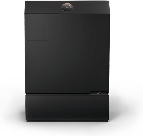
Lasso Loop is developing a home recycling appliance that cleans, sorts, and processes recyclable materials for collection and reuse.
Our team of 2 designers and 3 developers explored how its companion app could help people understand the appliance’s status and their recycling progress.
The challenge
What does a recycling total actually mean?
The existing designs risked overwhelming users with information without making the next step clear. Users needed to understand:
 Does my appliance need attention?
How full is it, and when should it be emptied?
 How much have I recycled?
What do the numbers mean, and how is my activity changing?
The experience also needed to work for people with different levels of interest in recycling and comfort with technology.
Discovery
Learning how other products make information clear
I began with a competitive analysis recycling platforms and analyzed How We Feel and Apple Fitness to explore how products explain information and communicate progress.
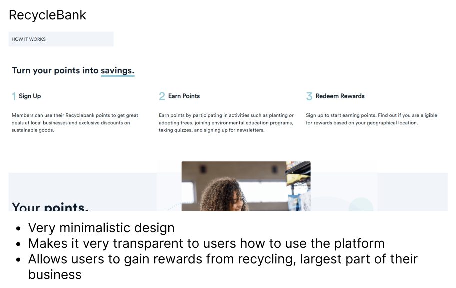
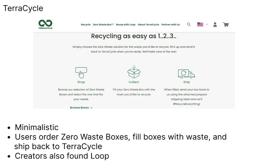
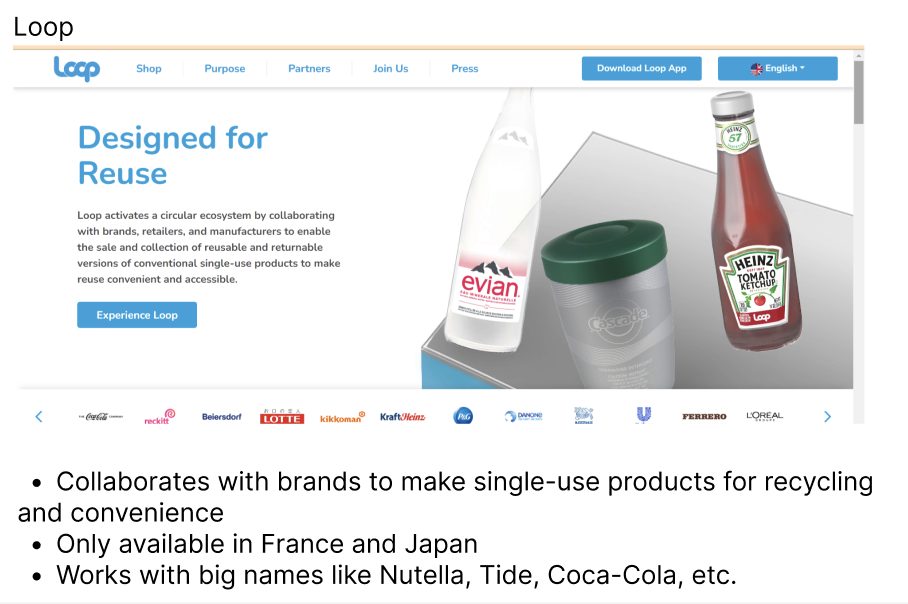
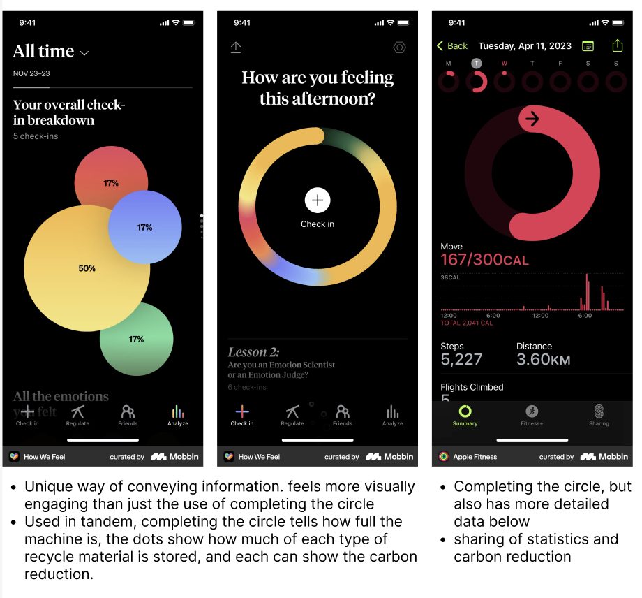
After conducting a competitive analysis, I discovered what my approach should be:
Keep guidance simple.
Across other recycling platforms, information was conveyed in a minimalistic and simple manner to make content easily understandable.
Make progress easy to recognize.
How We Feel and Apple Fitness used color and visual patterns to make personal metrics easy to grasp without lengthy explanations.
Designing for different levels of involvement
With limited time for independent research, we used client-provided insights to develop three working personas:

The sustainability advocate
Wants to understand their contribution and encourage others to participate.

The confident app user
Can navigate the app and help others manage the appliance.

The casual participant
Wants to recycle with minimal effort or interaction with the app.
These personas helped me consider both quick status checks and more detailed exploration. They were working assumptions based on client-provided research, rather than independently validated user groups.
Design direction: give each page a clear purpose
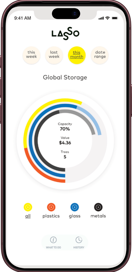
The original app opened directly to a dense metrics page, with no homepage to orient users. This made it difficult to quickly check appliance status or understand recycling progress.
Thus, I refined the original design around clear priorities: checking appliance status and understanding recycling progress.
User goals
Homepage: Quickly understand the appliance’s status and whether it needs attention.
Design focus: Make fullness levels and essential information easy to find.
Metrics page: Understand recycling activity and progress over time.
Design focus: Present clear totals, trends, and familiar comparisons to make contributions meaningful.
With clear user goals, I explored ways to make appliance status and recycling progress easy to understand while encouraging continued use.
Exploration
From a growing garden to more direct information
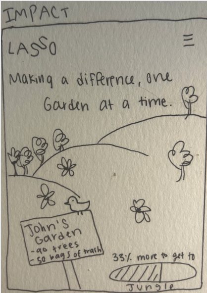
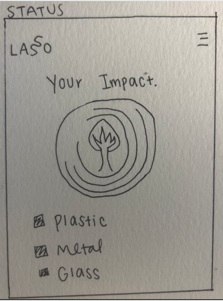
My early sketches used trees that grew into a garden as users recycled more. I wanted progress to feel visible and encouraging.
After reviewing the concept with the client and project team, I simplified the direction. The garden added another visual system to interpret, while users first needed to understand their recycling data.
I shifted toward prominent numbers and familiar comparisons, keeping the encouraging tone while making the information more direct.
Key design decisions
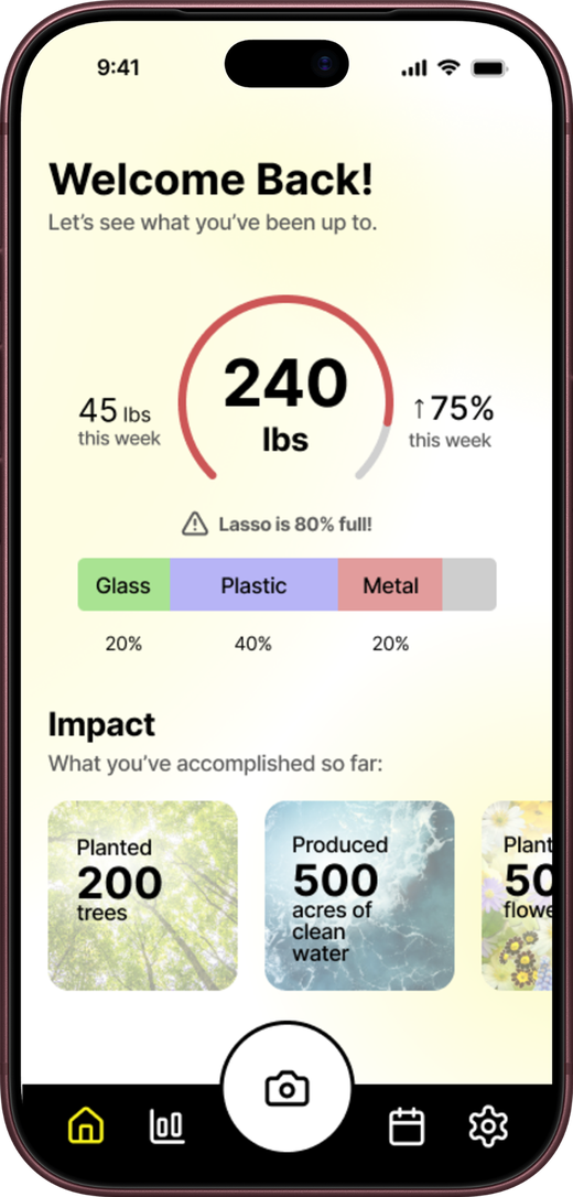
I highlighted fullness levels and essential details so users could quickly see when the appliance needed attention, while encouraging messages acknowledged their recycling efforts.
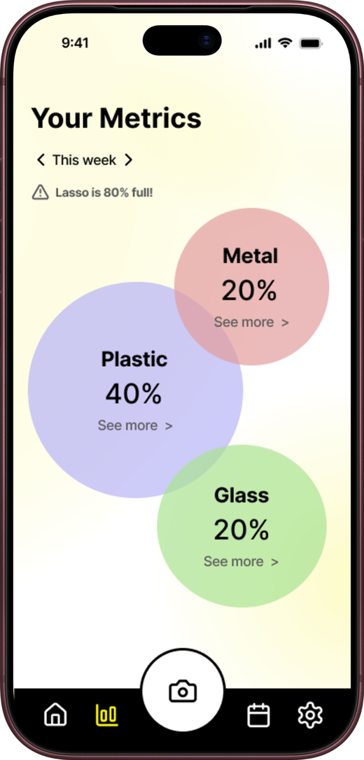
On the metrics page, I moved away from a color-based wheel and emphasized numeric values. This gave users a direct way to read their progress without relying on color alone.
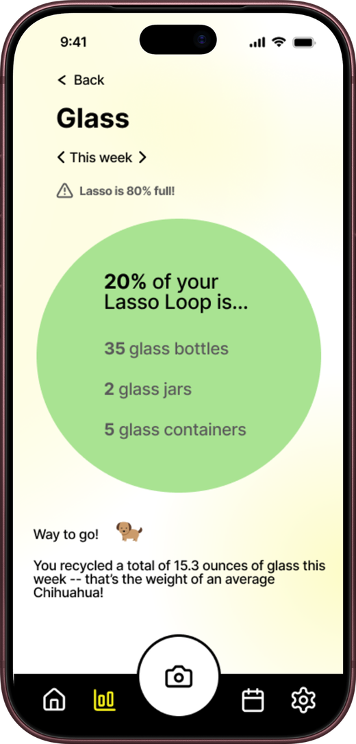
I paired recycling totals with familiar comparisons, such as the approximate weight of a small dog. The comparison gave users a way to picture the quantity while keeping the actual measurement visible.
Final design
A clearer view of the appliance and its activity

I developed both pages from sketches into wireframes and an interactive prototype, refining the hierarchy and presentation through feedback from the client and project team.
The homepage focused on appliance status, while the metrics page combined clear numbers, familiar comparisons, and encouraging messaging. We presented the final work to the client and club members for discussion and feedback.
The prototype established a proposed design direction. Its effect on comprehension and recycling behavior still needed to be tested.
I would test both pages with people who have different levels of recycling knowledge and comfort with apps, focusing on whether they could:
- Identify the appliance’s fullness and recognize when it needed attention.
- Find and explain their recycling totals.
- Understand the comparisons without confusing recycled quantity with environmental benefit.
- Move between checking status and exploring progress without assistance.
What did I learn?

Learning to simplify without losing meaning
This was my first UX project, and I loved how I had the freedom to explore. Leading both pages taught me to think about how individual screens work together, while giving each one a clear purpose.
It also taught me to revisit ideas I was excited about. The growing garden was fun to design, but feedback helped me focus on what people needed to understand. Working with the client and project team strengthened my ability to explain decisions, incorporate different perspectives, and simplify the experience.