
A clearer way to handle suspicious emails
NextEra Energy’s email security systems quarantine suspicious messages to protect employees and company information. Employees need a way to understand what was flagged and request a review when an email may be legitimate.
As a Human-Centered Design Intern, I refined an early prototype for a new company-wide app. I partnered with cybersecurity and development to make the experience easier to follow while working within the company’s security requirements.
The challenge
Employees needed to know what to do, and what happened next

The early prototype grouped emails awaiting release with emails that had not yet been requested. It also brought email categories, request status, and release actions together without a clear separation.
That made it difficult to distinguish two tasks: reviewing a quarantined email and checking an existing request.
The design challenge was to make those steps clear while keeping release decisions with IT support.
My approach
Understand the constraints before changing the experience
With limited time for new research, I built on insights gathered by the previous designer and focused on improving the prototype. I centered my designs through three approaches:




Design decisions
Separate the tasks. Clarify the next step.
The early design mixed messages that needed a decision with requests already in progress. I separated these into Quarantined Emails and Release Status.
This gave each page a clear purpose: one for reviewing messages and requesting release, the other for following what happened afterward.
Employees needed enough context to decide whether an email warranted a release request. I organized the experience around reviewing the message’s category and previewing its content before contacting IT support.
The intent was to make the request process easier to follow while preserving IT’s responsibility for the security review.
The app needed to work for employees with different levels of technical comfort. I used NextEra’s Enterprise Design System and organized the experience around four core pages: Login, Home, Quarantined Emails, and Release Status.
As the design developed, I refined typography, sizing, and visual hierarchy to make information easier to scan and actions easier to identify.
Iteration
Refining the details with UX, cybersecurity, and development
I moved from low-fidelity sketches to more detailed designs, reviewing the work regularly with my manager and the HumanITy team. Their feedback helped me refine the page structure and user flows.
Working closely with the developer helped me connect interface decisions to the underlying quarantine process. I then collaborated on functional prototypes and refined the details with input from cybersecurity and UX partners.
Outcome
A final prototype with a clearer path through quarantine
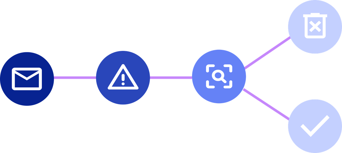
The final prototype separated email review from request tracking and organized the experience around distinct tasks. It received approval from the cybersecurity team and managers, and I presented it to leaders within the IT department.
These changes were designed to help employees understand their next step. Their effect on usability and security still needed to be validated through employee testing.
What I would test next...
I would ask employees to review a quarantined message, request its release, and check its status. I would focus on whether they could:

Distinguish a quarantined email from a pending release request
Understand that requesting release does not mean an email has been approved.

Find the information they needed without assistance.
Task completion, navigation errors, and employees’ explanations of each status would help identify where the design needed further work.
What did I learn?

Clear design starts with understanding the system
This was my first corporate internship, and it taught me how much good design depends on asking questions. Working with cybersecurity and development helped me understand the reasons behind requirements and make more informed decisions.
I also became much more confident explaining my work to people outside UX. Connecting each design choice to a specific problem made those conversations more useful and helped me turn feedback into a clearer experience.