Project 1: Making energy insights easier to understand
I returned to NextEra Energy’s HumanITy team, the company’s in-house UX and experience architecture team, as a second-year intern to lead research for a platform serving sales representatives and Commercial & Industrial (C&I) customers.
The platform brings together customer-specific energy data to support purchasing and planning decisions. It needed to help sales representatives explain complex information and give customers a way to understand that information independently. An initial design existed, but usability concerns remained before launch.
The challenge
What was keeping the platform from being ready?

My research focused on three questions:
- Where did sales representatives struggle with the existing platform?
- What support did they need throughout the sales process?
- What would make the platform easier to use during customer conversations and independently?
Research approach
Understanding the work before evaluating the screens
To better understand sales representatives’ needs, I combined interviews, usability testing, and an interface review to identify where the platform fell short.
 Recruit sales representatives
 Understand their workflow
 Observe platform use
 Evaluate the interface
 Share findings with stakeholders
Seeing the sales journey beyond the platform
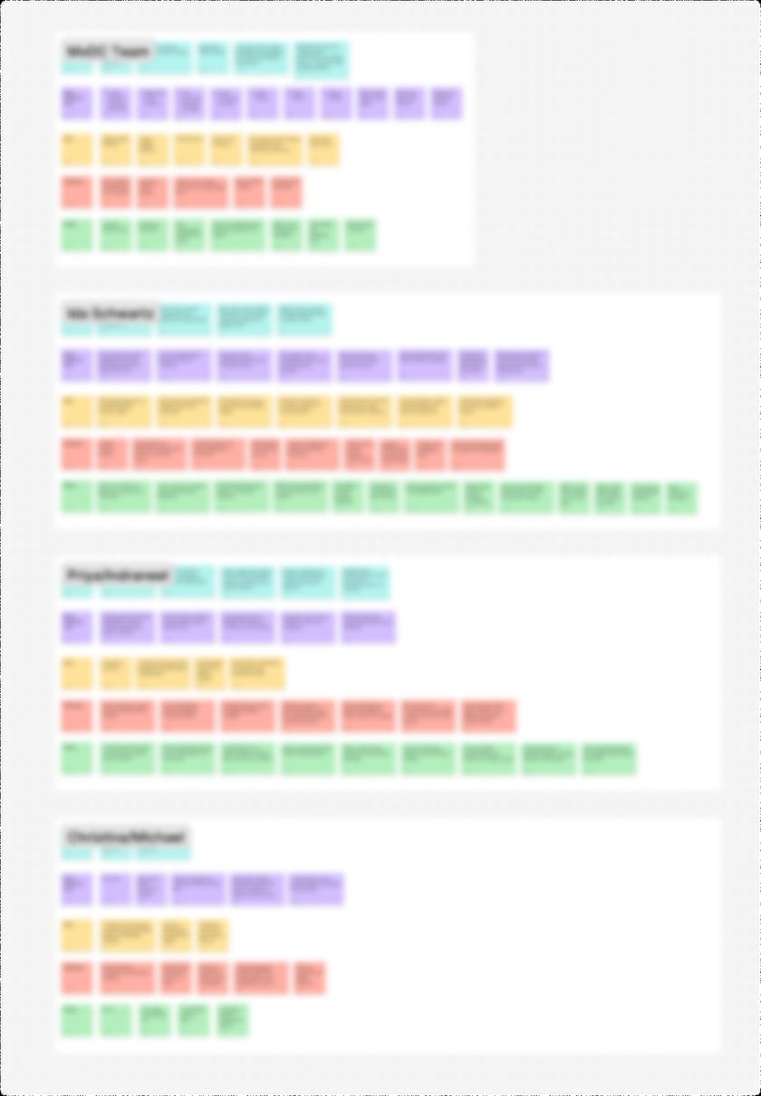
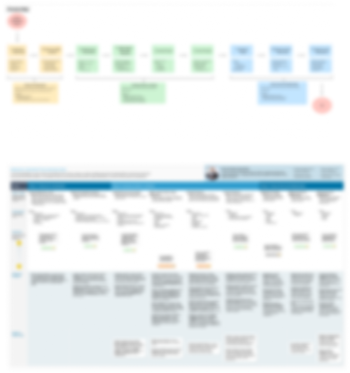
I mapped the sales representative’s journey from researching potential clients to advising customers and maintaining relationships. Bringing the interview findings into one view helped reveal where scattered information, internal coordination, and ongoing customer questions made the process difficult.
The map connected these challenges to specific stages of the sales journey, showing where the platform could better support representatives’ work.
Key findings
What did sales representatives actually need?
Sales representatives relied on multiple tools and sources to build an understanding of each client. Bringing that information together and making sense of it added work before they could advise a customer.
“We're having to gather info from a lot of different tools — and [platform] could be better, an easier way to find those basic things.” - NextEra Energy Sales Representative
The opportunity extended beyond displaying energy data. The platform could help representatives find relevant client information and understand it in one place.
Design direction: A dedicated client page bringing together relevant information and sources, with access that preserves confidentiality.
Our initial focus was the website, but interviews revealed friction across the broader sales process. Representatives depended on input from teams such as legal, credit, and pricing. Conflicting priorities and internal coordination could delay progress for clients.
“Getting the information isn't the difficult part. It's analyzing it and being aligned internally [that] seems to be the difficult part sometimes.” - NextEra Energy Sales Representative
This finding expanded how I understood the problem. Some delays came from coordination between people and teams, so interface changes alone would not address every pain point.
Design direction: Explore how shared client information could support coordination, while identifying which issues would require process changes beyond the platform.
Representatives wanted customers to understand their data and find answers without always needing a one-on-one conversation. Yet representatives themselves encountered hidden features and difficult navigation, and some were less comfortable using digital tools.
These findings raised concerns about independent customer use. They also identified questions that would need to be tested directly with customers.
Design direction: Create a clearer customer homepage, standardize filters, improve graph contrast, and add help where questions are likely to arise.
The platform depended on customer-specific data, but representatives were unsure how to use it with new clients whose information was not yet available.
This exposed a gap in the experience: the platform needed to support the steps before a complete customer view existed.
Design direction: Define onboarding and clarify what information is required, what is missing, and what users can do next.
Recommendations
How could these findings guide the redesign?

Make the interface easier to understand
Standardize filters, improve graph contrast, add contextual help, and use validation indicators to clarify feedback.

Create clearer entry points
Develop a customer homepage and define onboarding for clients whose data is not yet available.

Bring client information together
Explore a shared client page that supports access to relevant sources while preserving confidentiality.

Explore support for customer questions
Consider AI-assisted help as a potential way to answer questions without requiring a sales representative for every interaction.
Together, these findings pointed toward a platform that makes information easier to find, understand, and act on — for both sales representatives and customers.
The recommendations focused on clearer navigation, smoother onboarding, shared client information, and more independent customer support, with further testing needed to refine these ideas.
Handoff and next steps
What did the research contribute?
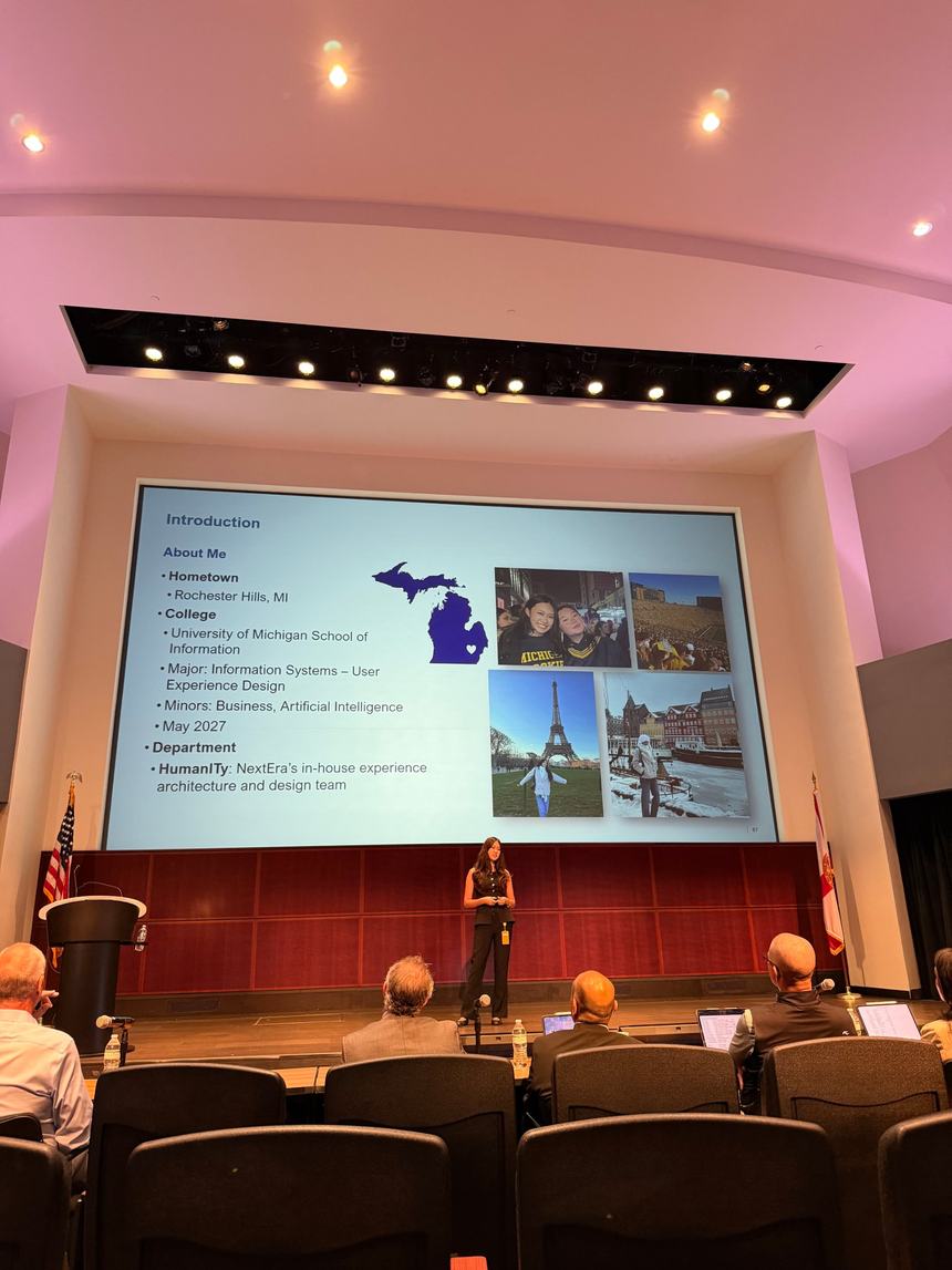
I shared my findings and recommendations with stakeholders to help guide the redesign, connecting usability issues with the challenges sales representatives faced in their daily work.
While my internship ended before design work began, the proposed next step was to agree on priorities and build a roadmap before testing changes with sales representatives and customers.
What did I learn?



How to connect user needs with business realities
This project was SO cool and really taught me to look beyond the initial brief. What started as a website review turned into a deeper look at how sales teams work, from piecing together information across tools to coordinating with different departments. Interviews uncovered so much I wouldn’t have noticed by looking at the screens alone.
I also loved the challenge of making research click for people who don’t work in UX. It pushed me to turn a lot of information into clear takeaways and recommendations the team could use.
If I could keep going, I’d be excited to test those ideas with sales representatives and customers, especially to see how they make sense of energy data on their own and get started when some information is still missing.